
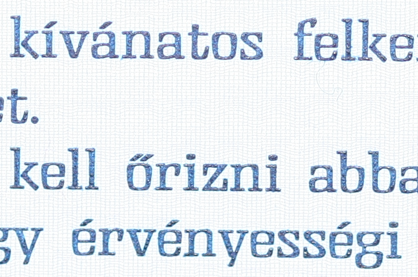
Diacritical: őŐűŰ acute and double acute have differently-angled accents
Bug #656647 reported by
Thorsten
This bug affects 2 people
| Affects | Status | Importance | Assigned to | Milestone | |
|---|---|---|---|---|---|
| Ubuntu Font Family |
Fix Released
|
High
|
Unassigned | ||
Bug Description
In Hungarian, the letters Ő, ő, Ű and ű frequently occur together with other long vowels Á, É, Í, Ó, Ú, á, é, í, ó, and ú. While the general form of used accent marks (acute and double acute, respectively) can vary widely from font to font, the acute is commonly identical to both components of the double acute. Having different forms (even if the only difference is the angle) makes this font essentially unusable for proper Hungarian typography.
Related branches

| Changed in ubuntu-font-family: | |
| milestone: | 1.00 → 0.70 |
| Changed in ubuntu-font-family: | |
| status: | Confirmed → Fix Committed |
To post a comment you must log in.
Examples from screenshot above are: "főváros" and "első év".
I'll grant you that it does look a bit off-putting! Thank you for bringing it up, lets see if Dalton Maag can advise.