
Improve in-game checkboxes
Bug #986534 reported by
Hans Joachim Desserud
This bug affects 1 person
| Affects | Status | Importance | Assigned to | Milestone | |
|---|---|---|---|---|---|
| widelands |
Fix Released
|
Low
|
Chuck Wilder | ||
Bug Description
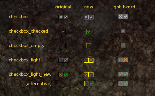
Currently the checkboxes will display as following:
not selected: red X
selected: green check mark
This is slightly misleading, as someone earlier today on IRC interpreted the X as "this option is activated". Furthermore someone else mentioned that the color codes is of little help for red/green color blinds. Since this is the case for a substantial portion of the population, we should fix this to make WL more accessible.
I guess there is a reason why checkboxes traditionally are either empty or has the check mark. Therefore the obvious option is to remove the red X. Note that we might look at improving the borders at the same time since I am not sure how visible these are without the X.
Related branches
lp:~hjd/widelands/checkbox-light
- Widelands Developers: Pending requested
-
Diff: 22 lines (+2/-2)1 file modifiedsrc/ui_basic/checkbox.cc (+2/-2)

| Changed in widelands: | |
| status: | New → Confirmed |
To post a comment you must log in.
I have never been confused by that because for me, green means activated and red not.
But I could imagine that it can be misleading for red/green color blinds. Removing the red X seems a good idea, but as you have already observed, the checkbox might then be badly visible. What about making them much brighter?