Merge lp:~3v1n0/ubuntu-themes/headerbar-destructive-theming into lp:ubuntu-themes

Proposed by Marco Trevisan (Treviño)
Status: Merged
Approved by: Iain Lane
Approved revision: 587
Merged at revision: 587
Proposed branch: lp:~3v1n0/ubuntu-themes/headerbar-destructive-theming
Merge into: lp:ubuntu-themes
Prerequisite: lp:~c-lobrano/ubuntu-themes/bug-1721102
Diff against target: 283 lines (+232/-2)
2 files modified
Ambiance/gtk-3.20/gtk-widgets.css (+116/-1)
Radiance/gtk-3.20/gtk-widgets.css (+116/-1)
To merge this branch: bzr merge lp:~3v1n0/ubuntu-themes/headerbar-destructive-theming
Reviewer Review Type Date Requested Status
Iain Lane Approve
Review via email: mp+332612@code.launchpad.net

Commit message

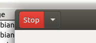
Ambiance, Radiance: add theming for headerbar .destructive-action button's

Based on same .suggested-action theming.

To post a comment you must log in.
Revision history for this message
Iain Lane (laney) wrote :

code looks good, thanks

might be too much of a change to SRU, but I leave that decision to you & others

review: Approve
Revision history for this message
Iain Lane (laney) wrote :

Preview Diff

[H/L] Next/Prev Comment, [J/K] Next/Prev File, [N/P] Next/Prev Hunk
=== modified file 'Ambiance/gtk-3.20/gtk-widgets.css'
--- Ambiance/gtk-3.20/gtk-widgets.css 2017-10-12 05:18:40 +0000
+++ Ambiance/gtk-3.20/gtk-widgets.css 2017-10-23 08:58:03 +0000
@@ -67,7 +67,8 @@
67 border-color: transparent;67 border-color: transparent;
68}68}
6969
70button.destructive-action {70button.destructive-action,
71headerbar button.destructive-action {
71 color: white;72 color: white;
72 text-shadow: 0 1px alpha (shade (@error_bg_color, 1.55), 0.4);73 text-shadow: 0 1px alpha (shade (@error_bg_color, 1.55), 0.4);
73 background-color: shade (@error_bg_color, 1.1);74 background-color: shade (@error_bg_color, 1.1);
@@ -312,6 +313,26 @@
312 box-shadow: none;313 box-shadow: none;
313}314}
314315
316.horizontal.linked button:not(:only-child) {
317 background-clip: padding-box;
318}
319
320.horizontal.linked button.suggested-action:first-child,
321.horizontal.linked button.destructive-action:first-child {
322 border-left-width: 1px;
323 border-radius: 8px 0 0 8px;
324}
325
326.horizontal.linked button.suggested-action:not(:only-child):not(:first-child):not(:last-child) {
327 border-radius: 0;
328}
329
330.horizontal.linked button.suggested-action:last-child,
331.horizontal.linked button.destructive-action:last-child {
332 border-right-width: 1px;
333 border-radius: 0 8px 8px 0;
334}
335
315.linked.vertical button:backdrop:not(:only-child),336.linked.vertical button:backdrop:not(:only-child),
316.linked.vertical button.destructive-action:backdrop:not(:only-child),337.linked.vertical button.destructive-action:backdrop:not(:only-child),
317.linked.vertical button:disabled:not(:only-child),338.linked.vertical button:disabled:not(:only-child),
@@ -2604,6 +2625,100 @@
2604 text-shadow: none;2625 text-shadow: none;
2605}2626}
26062627
2628.primary-toolbar .linked button.suggested-action,
2629headerbar .linked button.suggested-action {
2630 box-shadow: inset 1px 0 @suggested_action_bg,
2631 inset -1px 0 shade (@suggested_action_bg, 0.65);
2632}
2633
2634.primary-toolbar .linked button.suggested-action:first-child,
2635headerbar .linked button.suggested-action:first-child {
2636 box-shadow: inset -1px 0 shade (@suggested_action_bg, 0.65);
2637}
2638
2639.primary-toolbar .linked button.suggested-action:last-child,
2640headerbar .linked button.suggested-action:last-child {
2641 box-shadow: inset 1px 0 @suggested_action_bg;
2642}
2643
2644.primary-toolbar .linked button.suggested-action:backdrop,
2645headerbar .linked button.suggested-action:backdrop {
2646 box-shadow: inset 1px 0 shade (@suggested_action_bg, 0.65),
2647 inset -1px 0 shade (@suggested_action_bg, 0.65);
2648}
2649
2650/* destructive action */
2651headerbar button.destructive-action:not(:disabled) * {
2652 color: white;
2653 text-shadow: 0 -1px shade (@dark_bg_color, 1.2);
2654}
2655
2656headerbar button.destructive-action:not(:disabled) {
2657 background-image: -gtk-gradient (linear, left top, left bottom,
2658 from (shade (@error_bg_color, 1.10)),
2659 to (shade (@error_bg_color, 0.90)));
2660 border-radius: 12px;
2661}
2662
2663headerbar button.destructive-action:hover {
2664 background-image: -gtk-gradient (linear, left top, left bottom,
2665 from (shade (@error_bg_color, 0.93)),
2666 to (shade (@error_bg_color, 0.75)));
2667}
2668
2669headerbar button.destructive-action:backdrop:not(:disabled) * {
2670 color: shade (white, 0.65);
2671}
2672
2673headerbar button.destructive-action:backdrop:not(:disabled) {
2674 background-image: -gtk-gradient (linear, left top, left bottom,
2675 from (shade (@error_bg_color, 0.65)),
2676 to (shade (@error_bg_color, 0.65)));
2677}
2678
2679headerbar button.destructive-action:hover:backdrop {
2680 background-image: -gtk-gradient (linear, left top, left bottom,
2681 from (shade (@error_bg_color, 0.77)),
2682 to (shade (@error_bg_color, 0.75)));
2683}
2684
2685headerbar button.destructive-action:hover:backdrop * {
2686 color: shade (white, 0.67);
2687}
2688
2689headerbar button.destructive-action:active {
2690 background-image: -gtk-gradient (linear, left top, left bottom,
2691 from (shade (@error_bg_color, 0.80)),
2692 to (shade (@error_bg_color, 0.65)));
2693}
2694
2695headerbar button.destructive-action:disabled * {
2696 color: @fg_color;
2697 text-shadow: none;
2698}
2699
2700.primary-toolbar .linked button.destructive-action,
2701headerbar .linked button.destructive-action {
2702 box-shadow: inset 1px 0 @error_bg_color,
2703 inset -1px 0 shade (@error_bg_color, 0.65);
2704}
2705
2706.primary-toolbar .linked button.destructive-action:first-child,
2707headerbar .linked button.destructive-action:first-child {
2708 box-shadow: inset -1px 0 shade (@error_bg_color, 0.65);
2709}
2710
2711.primary-toolbar .linked button.destructive-action:last-child,
2712headerbar .linked button.destructive-action:last-child {
2713 box-shadow: inset 1px 0 @error_bg_color;
2714}
2715
2716.primary-toolbar .linked button.destructive-action:backdrop,
2717headerbar .linked button.destructive-action:backdrop {
2718 box-shadow: inset 1px 0 shade (@error_bg_color, 0.65),
2719 inset -1px 0 shade (@error_bg_color, 0.65);
2720}
2721
2607.primary-toolbar separator,2722.primary-toolbar separator,
2608.primary-toolbar separator,2723.primary-toolbar separator,
2609.primary-toolbar separator:disabled,2724.primary-toolbar separator:disabled,
26102725
=== modified file 'Radiance/gtk-3.20/gtk-widgets.css'
--- Radiance/gtk-3.20/gtk-widgets.css 2017-10-12 05:18:40 +0000
+++ Radiance/gtk-3.20/gtk-widgets.css 2017-10-23 08:58:03 +0000
@@ -66,7 +66,8 @@
66 border-color: transparent;66 border-color: transparent;
67}67}
6868
69button.destructive-action {69button.destructive-action,
70headerbar button.destructive-action {
70 color: white;71 color: white;
71 text-shadow: 0 1px alpha (shade (@error_bg_color, 1.55), 0.4);72 text-shadow: 0 1px alpha (shade (@error_bg_color, 1.55), 0.4);
72 background-color: shade (@error_bg_color, 1.1);73 background-color: shade (@error_bg_color, 1.1);
@@ -311,6 +312,26 @@
311 box-shadow: none;312 box-shadow: none;
312}313}
313314
315.horizontal.linked button:not(:only-child) {
316 background-clip: padding-box;
317}
318
319.horizontal.linked button.suggested-action:first-child,
320.horizontal.linked button.destructive-action:first-child {
321 border-left-width: 1px;
322 border-radius: 8px 0 0 8px;
323}
324
325.horizontal.linked button.suggested-action:not(:only-child):not(:first-child):not(:last-child) {
326 border-radius: 0;
327}
328
329.horizontal.linked button.suggested-action:last-child,
330.horizontal.linked button.destructive-action:last-child {
331 border-right-width: 1px;
332 border-radius: 0 8px 8px 0;
333}
334
314.linked.vertical button:backdrop:not(:only-child),335.linked.vertical button:backdrop:not(:only-child),
315.linked.vertical button.destructive-action:backdrop:not(:only-child),336.linked.vertical button.destructive-action:backdrop:not(:only-child),
316.linked.vertical button:disabled:not(:only-child),337.linked.vertical button:disabled:not(:only-child),
@@ -2605,6 +2626,100 @@
2605 text-shadow: none;2626 text-shadow: none;
2606}2627}
26072628
2629.primary-toolbar .linked button.suggested-action,
2630headerbar .linked button.suggested-action {
2631 box-shadow: inset 1px 0 @suggested_action_bg,
2632 inset -1px 0 shade (@suggested_action_bg, 0.65);
2633}
2634
2635.primary-toolbar .linked button.suggested-action:first-child,
2636headerbar .linked button.suggested-action:first-child {
2637 box-shadow: inset -1px 0 shade (@suggested_action_bg, 0.65);
2638}
2639
2640.primary-toolbar .linked button.suggested-action:last-child,
2641headerbar .linked button.suggested-action:last-child {
2642 box-shadow: inset 1px 0 @suggested_action_bg;
2643}
2644
2645.primary-toolbar .linked button.suggested-action:backdrop,
2646headerbar .linked button.suggested-action:backdrop {
2647 box-shadow: inset 1px 0 shade (@suggested_action_bg, 0.65),
2648 inset -1px 0 shade (@suggested_action_bg, 0.65);
2649}
2650
2651/* destructive action */
2652headerbar button.destructive-action:not(:disabled) * {
2653 color: white;
2654 text-shadow: 0 -1px shade (@dark_bg_color, 1.2);
2655}
2656
2657headerbar button.destructive-action:not(:disabled) {
2658 background-image: -gtk-gradient (linear, left top, left bottom,
2659 from (shade (@error_bg_color, 1.10)),
2660 to (shade (@error_bg_color, 0.90)));
2661 border-radius: 12px;
2662}
2663
2664headerbar button.destructive-action:hover {
2665 background-image: -gtk-gradient (linear, left top, left bottom,
2666 from (shade (@error_bg_color, 0.93)),
2667 to (shade (@error_bg_color, 0.75)));
2668}
2669
2670headerbar button.destructive-action:backdrop:not(:disabled) * {
2671 color: shade (white, 0.65);
2672}
2673
2674headerbar button.destructive-action:backdrop:not(:disabled) {
2675 background-image: -gtk-gradient (linear, left top, left bottom,
2676 from (shade (@error_bg_color, 0.65)),
2677 to (shade (@error_bg_color, 0.65)));
2678}
2679
2680headerbar button.destructive-action:hover:backdrop {
2681 background-image: -gtk-gradient (linear, left top, left bottom,
2682 from (shade (@error_bg_color, 0.77)),
2683 to (shade (@error_bg_color, 0.75)));
2684}
2685
2686headerbar button.destructive-action:hover:backdrop * {
2687 color: shade (white, 0.67);
2688}
2689
2690headerbar button.destructive-action:active {
2691 background-image: -gtk-gradient (linear, left top, left bottom,
2692 from (shade (@error_bg_color, 0.80)),
2693 to (shade (@error_bg_color, 0.65)));
2694}
2695
2696headerbar button.destructive-action:disabled * {
2697 color: @fg_color;
2698 text-shadow: none;
2699}
2700
2701.primary-toolbar .linked button.destructive-action,
2702headerbar .linked button.destructive-action {
2703 box-shadow: inset 1px 0 @error_bg_color,
2704 inset -1px 0 shade (@error_bg_color, 0.65);
2705}
2706
2707.primary-toolbar .linked button.destructive-action:first-child,
2708headerbar .linked button.destructive-action:first-child {
2709 box-shadow: inset -1px 0 shade (@error_bg_color, 0.65);
2710}
2711
2712.primary-toolbar .linked button.destructive-action:last-child,
2713headerbar .linked button.destructive-action:last-child {
2714 box-shadow: inset 1px 0 @error_bg_color;
2715}
2716
2717.primary-toolbar .linked button.destructive-action:backdrop,
2718headerbar .linked button.destructive-action:backdrop {
2719 box-shadow: inset 1px 0 shade (@error_bg_color, 0.65),
2720 inset -1px 0 shade (@error_bg_color, 0.65);
2721}
2722
2608.primary-toolbar separator,2723.primary-toolbar separator,
2609.primary-toolbar separator,2724.primary-toolbar separator,
2610.primary-toolbar separator:disabled,2725.primary-toolbar separator:disabled,

Subscribers

People subscribed via source and target branches